Is CW use really growing?
Original report April 2014
See 2020 update below
We hear lots of speculation about whether the use of CW on HF is up or down in the seven years since it was no longer required for a ham radio license. I decided to get a pretty objective measure of activity from the Reverse Beacon Network, or RBN. If you are not familiar with the RBN, it is a world wide network of automated receivers that log all the CW call signs they hear to a central database.
The good folks at the RBN generously make all their data available publicly on their web site. I used their data back to Jan 2011 which gives us over three years of data with which to look for trends. The RBN does have some earlier data but it does not record CW speed and the quantity is significantly less and so may not be a good sample size. I performed some analysis on this data and below are the results and my interpretations.
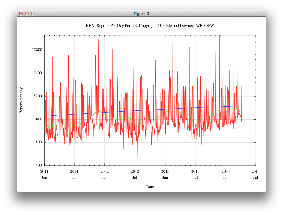
Above is a graph of the total number of reports issued to the RBN each day, divided by the number of reporting stations. This normalization reduces the effect of a varying number of reporting stations over time. Note the vertical axis is plotted on a log scale. This prevents the high values on contest days from smashing down the data on more typical days. The red lines are the raw data, the green line is a running average (technically a Bezier fit) and the blue line is the best fit log model.
This graph is effectively a measure of overall daily activity. One thing we can see in the data are several prominent spikes. Looking closely, we see that these repeat at the same date each year and in fact correspond to the big contests. This increases our confidence in the validity of the data. Another trend we see in the green line is a seasonal increase in activity in the winter (northern hemisphere) and a decrease in the summer. This agrees with my own on-air experience and further validates the data. But to get back to our main question, it is also clear that there is a definite increase in CW activity over the period of this data. The fit identifies an increase of about 20 percent per year.
But this form of the data might be misleading. For example, we can not tell from this whether this activity is from broad activity, or just a few fervent operators. So we might look for another cut through the data to give an even clearer indication.
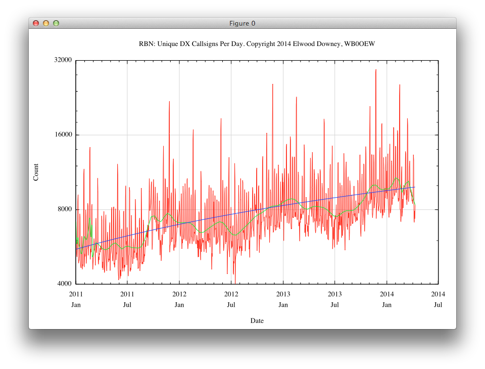
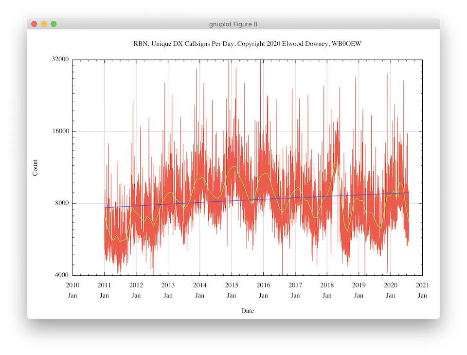
Above is a graph of the number of unique call signs that were reported each day by all receivers. The colors and scale are the same as before. Now we are getting insight into the total number of different hams on the air. These data certainly suggest that there are more and more CW operators getting on the air doing something. The fit also indicates an increase of about 20 percent per year.
Can we tell anything about the relative participation of these operators? Yes, by using a technique known as a cumulative histogram, we can explore whether all this activity is predominantly from a few operators or if it is spread around evenly.
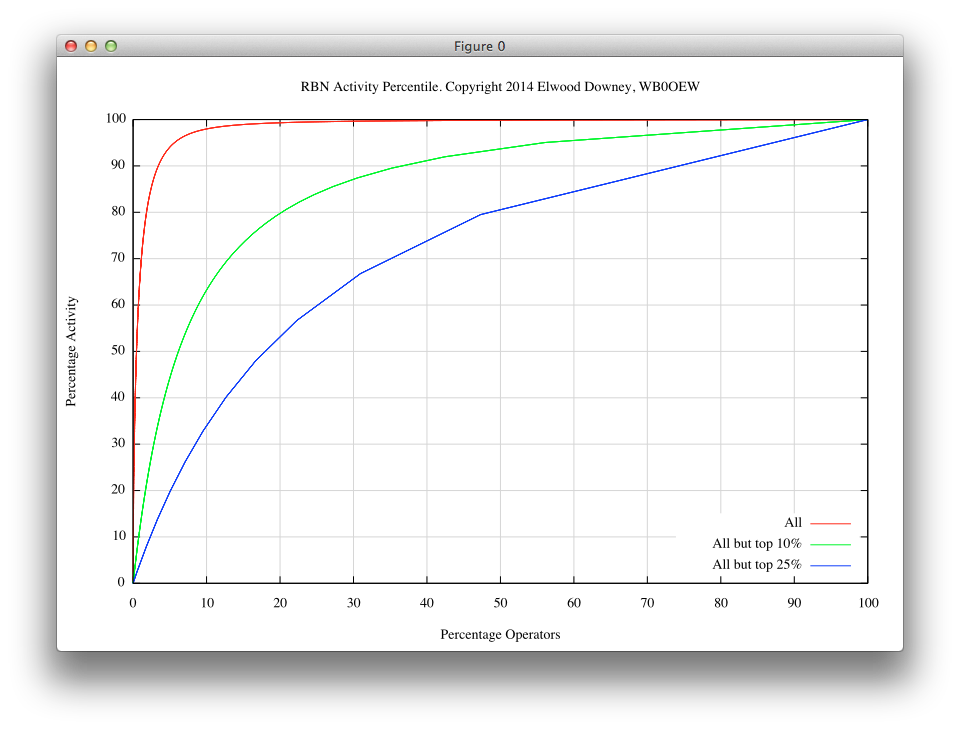
The graph above shows percentages on each axis. The horizontal axis is the percentage of operators that created the percentage of activity shown on the vertical axis. In a graph of this type, a straight line from the lower left to upper right corners would indicate equal participation by all operators. The red line shows that ten percent of all operators create almost all of the RBN activity.
Recalling the spikes in the first two graphs, I was wondering if these percentages were being dominated by operators who mainly only operate during the big contests. The green and blue lines show the participation after removing the top 10 and 25 percent most active operators in terms of their total number of RBN log entries. After removing the most active operators we can see the base of participation becomes broader.
With such a wide mix of heavy users and more casual operators, I then wondered whether there was a trend to the operating speeds used by operators recorded by the RBN.
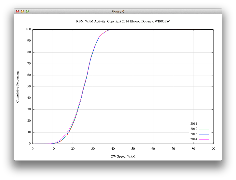
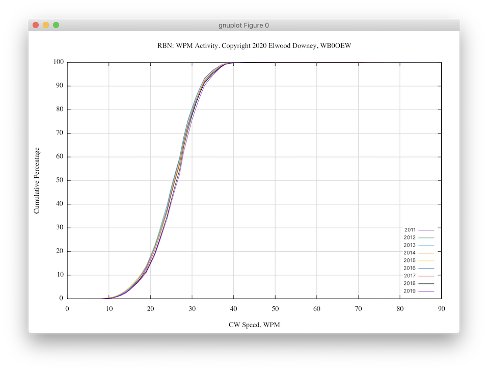
The graph above shows the cumulative number of operators reported as operating at or below a given speed for each year. As one can see by comparing the plots for each year, there does not seem to be any tendency for speeds to change over the time span of this study. The median speed throughout this period is about 26 WPM.
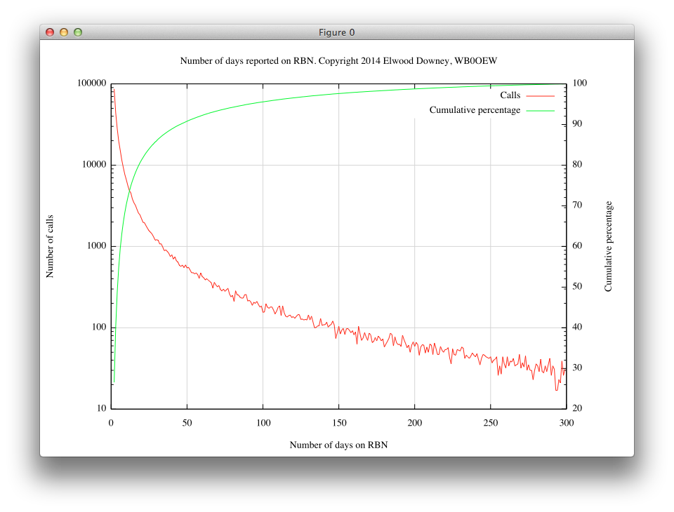
So if the speeds are not changing over time, I then wondered how long a given operator stays active.
Conclusion
Using the Reverse Beacon Network data, we can say there is indeed a modest increase in overall CW activity over time. We can also say that the vast majority of activity is from a small core of enthusiasts. If CW usage is to continue to grow, ways must be found to retain those folks who try it only briefly or eventually the current base will fade away and CW usage along with it.
My thanks to everyone at the RBN, all the reporting stations and, perhaps especially, to all those hams who are keeping the venerable CW mode alive.
73, Elwood Downey, WBØOEW
Update 2020
Seasonal trend still evident, but number of reported stations no longer increasing.
Speeds remain remarkably consistent: